|
Materials Needed: Titanium White, Cadmium Yellow, Yellow Ochre Pale, Cadmium Red, Terra Rosa, Transparent Oxide Red (Rembrandt), Alizarin Crimson, Ivory Black, Viridian (Rembrandt), Cobalt Blue Light, Ultramarine Blue Deep The beginning of understanding color begins with the doing of the color charts. You notice I didn't say looking at the color charts. In doing the color charts we gain a great deal of control over the creation and understanding of color, among other equally important things. Components of color perception such as value, hue, intensity, and temperature all can be well understood through the careful study of color charting. (artistic license inserted here). Here is a little free advice ... don't do the color charts like I first did! I rushed through and didn't get the full benefit. I unfortunately did not understand how important they would be in my future. I just wanted to get to the “good” stuff like painting and not do this mechanically unartistic part. Do your charts conscientiously and with purpose. When done carefully, they will serve you well for years. The charts that I am going to describe here are based on the charts I did in school and were developed by some pretty smart painters and given to me by Mr. Smuskiewicz my oil painting teacher at school. Notice I said “painters” not chemists or particle wave physicists. With these charts you will gain in color mixing, value judgment in full color, drying time of your various paints, skill development with a palette knife and the fade and crack resistance of your paints. If done on your regular painting canvas you may also have some idea of how the paintings you have sold may be aging. There are many theories on how color charts should be done. Here is one more. Each chart is based on the influence of one color dominating all others in simple two color mixtures. The two color mixtures are then mixed with white to study the results when those mixtures are lightened with white. In Mr. Krajecki's fundamentals class we also did watercolor charts where water was added in order to lighten the mixture. The results from the two classes were quite different as one is opaque and the other transparent. White when added to a mixture changes it's appearance in a different way from thinning it down. Oil paint has the advantage of also being able to go the transparent route but watercolor, while often used with touches of white mixed in, more often looks like a series of corrections than intentional use. The exception is when in the hands of a master who's plan from the start was with the intention of using opaque touches from the beginning. Basically, I'm getting at the fact that adding white to pigment is different from thinning it down. In these charts we will be adding white to lighten paint mixtures and study the results. We begin by figuring out the size of the canvas that we will be using based on the number of pigments on our palette, not including white. My current basic palette of colors has eleven. Since my squares of color will be one inch squares, with a quarter inch in between each square and a three quarters of an inch border on the sides for handling ease, then the charts will be fifteen inches wide. There will be five squares down with similar spacing between with room for handling on the top and bottom which will equal seven and one half inches. In short my canvas will be 15” x 7.5”. Why did we have to go through all that? If you decide to use a different number of pigments or values of those mixtures then you will need to resize your canvas and you will need this formula. The first step in painting that I teach is don't ever start a painting until you know why you are doing it. Next is how you are going to do it. Think things through and you will backtrack and correct less often. There is much to be said about spontaneity as long as you plan for it! The materials we will need are; canvas cut to 15” x 7.5”, 1/4” tape, small trowel shaped palette knife, board on which to mount or temporarily tape the canvas, paper towels or rag, middle tone palette and a color corrected/balanced light source. My canvas is Belgian linen sealed with rabbit skin glue and primed with linseed oil and lead. My paints are professional grade oil paint mainly from Winsor/Newton or Talens Rembrandt. My usual palette is a well worn wooden arm palette but in my studio I often use a glass palette with gray paper under for proper tone. My lights in my studio are “Vita-Lite” by Duro-Test brand lights and are full-spectrum 5500k which yields a color just slightly on the cool side. I understand the company has also developed screw-in versions to replace incandescent bulbs. North light from a widow is excellent if available. 1/4” inch tape and trowel shaped palette knives are available through Pearl Paint Supply or other such art supply store. 1/4” Masonite makes a nice board. Any home improvement center should cut it to size usually for free. I like to work on a large board (18” x 24”) with the bottom resting on my lap as I sit and the back of the board resting on a table with my palette and canvas well lit but not glaring. Duct tape and paper towels are available everywhere.
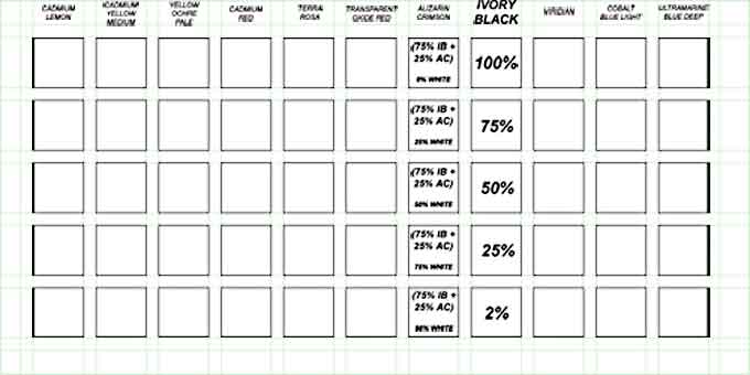
Most people prefer to sit to do the charts because there is a lot of turning of the canvas involved. Also even at a fast pace these charts usually take about 4 - 5 hours each. The first one can take days because of the unfamiliarity of the process but once the routine is understood it picks up speed. The charts are all laid out in the same manor. The colors laid out in the same order and the spacing is all the same. The only difference in the charts up to this point is that I prefer to make the main color of this chart written in a different way in order to identify it easily. This example below is obviously the IVORY BLACK chart. After becoming familiar with the charts through constant use, we know which chart is which just by looking at the overall color influence of the squares.
The green lines represent where the ¼ “ tape will go and the black squares represent the spaces in between that we will be filling in with the paint mixtures. As we lay out the pieces of tape, make all of the horizontal lines first and then the vertical to follow (or vice versa). This will make it much easier when removing the tape later. After putting the tape down run a finger nail over all the edges of the tape especially at the intersections so that the paint will not seep under as it is applied.
We are going to use a palette knife to apply the paint but I have heard good arguments for other methods of application. The palette or painting knife, as it is sometimes called, is used most often because it leaves a nice smooth square to use as a reference which is not influenced by oil paints nasty habit of causing glare on brush strokes which makes it difficult to see what color the square really is. Some may argue that we are not getting the real world look of our mixtures unless we happen to be palette knife painters who flatten every stroke down just like the charts. It is just a matter of choice but I recommend the knife over other methods of application. The palette knife is also a good choice because we have very little skill with this most versatile and expressive of tools and will be good practice if care is taken in the handling. The first column that we will paint will be the main color on which the chart is based. In this case it is the IVORY BLACK chart therefore we will begin with the Ivory Black column. This is relatively simple because the pigment is not mixed with anything other colors yet. The order that we paint the squares in is illustrated here.
We will be painting one column at a time, beginning with the main color of the chart which is Ivory Black in our example. Once the main color column has been painted, we move to a column next to the main column. For example in our case we may choose Alizarin Crimson or Viridian for our second column to paint. Then as we finish each column, we move out progressively until we finish at the ends of the chart. We begin each column with the top square. The second square to be painted is the bottom square. This square is to be just off white and just dark enough to clearly see the influence of the color being mixed into the white. This establishes our value range of this column. From here we paint the middle square of the column so that we are splitting the difference between the top and bottom perfectly. As we look down the row, the middle square should neither look as though it is favoring the top dark square nor the bottom light square. The fourth square to be painted is to split the difference between the top dark square and the middle square. Once again we look down the column, this time making sure that the fourth square does not favor the top or middle squares. The fifth then splits the difference between the bottom light square and the middle square. As we look down all five squares there should be no visual stumbling.
There should be a smooth transition from one square to the next. This is the order that all of the columns from this point on will be painted.
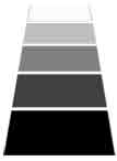
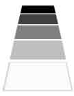
We learn from this part of our exercise how to choose values that are related to a particular value range. Our first column example has a full value range beginning with a very dark color and finishing with a value that is nearly white. We learn how to “fit” other values in between to create a smooth effect of change. But what about our Cadmium Lemon chart? Our main color will start out as much lighter value than the Ivory Black because the colors out of the tube are not the same value. Therefore the value range difference between the two will be apparent. The Ivory Black has a greater range of values than the Cadmium Lemon. The spitting process will then require different changes between each of the squares in the column. Now comes the tricky part. All of the bottom rows on all of the charts are to be exactly the same value. That means that the lightest value or bottom row of all the charts must be compared to each other in order to get this right. The bottom row and only the bottom row are to be compared across. They will be the only squares to relate across because the others will depend on the value of the top row in which all the squares begin as a different value because each of our pigments starts out as a different value. The value range, beginning with the top square as the mixture (100%) not yet mixed with white and the bottom square which is just off white (2%), are represented below.
These of course are visual percentages and not intended to give anyone the idea that there is any way to measure through weight or other means the amount of paint to mix. We will quickly learn that the pigments that we use are all of different tinting strengths and therefore must be mixed visually and not formulaically.
Believe it or not, that was the easy part. We use only one pigment and white. Now it gets a little complicated. Into all our hard work we are going to through two colors together in precise visual measurement, which is the whole point of the charts in the first place, and go through the whole procedure again. Below is illustrated the concept.
In our example the second column we choose is a combination of Ivory Black which is our main color for this chart and Alizarin Crimson which will be our influence color. The first square to be painted, as in the first column, is the top square. This square will be a mixture of Ivory Black and Alizarin Crimson in which Ivory Black will visually dominate the mixture. For an example I have chosen 75% visual influence of Ivory Black which is just a number for the people out there like me who like the idea of precise target for which to aim. It just means that the mixture should always be heavily dominated by the main color of the chart on which we are working while still clearly showing the effect of the influence color on the mixture. If we think about it, on the Alizarin Crimson chart there will also be a mixture of Alizarin Crimson and Ivory Black. There is no reason to repaint the square the same with equal influence of each pigment. So on one chart Ivory Black dominates and on the other Alizarin Crimson dominates. In this way we see how each color on our palette is changed when influenced by the other pigments. From this first square on top we proceed as with the previous column and paint the bottom square and then the middle and so on. Remember to visually check the bottom row colors in order keep them the same value. This bottom row is only time we check across. Each new column that we begin should have the same amount of visual change of the main color by the influence color. From here we complete all other columns until the chart is finished. As we look at the finished chart we should see the same amount of dominance of the main color on all the squares. When we are finished with the first chart, immediately and carefully remove the tape from the chart before the paint begins to dry. Once the paint begins to dry, it will be very difficult to remove the tape without damaging all the hard work that we just did. I chose the Ivory Black chart to illustrate first because of all of the controversy surrounding the use of black pigment on one's palette. When we have completed this chart we may be able to make an informed decision as to weather this pigment should be used or not. Any color we wish to add to the palette in the future should be preceded by doing a chart based on the new pigment and all the other colors on the palette and then make a decision if this should be added to the palette. I see so many painters looking at paint tubes in the store and trying to decide if they like the color as though they were picking out curtains or a tie. A color being added to one's palette should be added only if it fills a gap in color mixing. Most often the tube they are looking at is a color mixable from the colors they already have on their palette. They don't realize because they have not done their color charts and are mixing colors by habit instead of through careful thought and consideration. Now that we have done our charts, what do we do with them? In some weird way they are beautiful to us just as they are but do we really want the on the living room wall? I guess they would go with everything since they have all the colors we can mix. A better use of them is in the studio. In the studio we can see our subject matter, the charts, palette and canvas under the same light and make some pretty amazing discoveries. We may discover that our lights in our studio are not balanced but have a temperature cast to them. It's possible that the decision to paint the walls fusia was not such a good one. When we stand in different places in the studio we may see the color cast on our canvas change. As we watch the colors on our charts change and we become more sensitive to color in general, we wonder how we ever painted in such condition before at all. Once we are past the initial shock of how little we understood about the color influences around us, we can begin to use the charts in other ways. One way I like to use the charts is to tack them on the wall around my subject and look at different area of the subject and see if I can find the colors I see repeated on the charts somewhere. After a while of doing this I inevitably find that one chart is giving me more colors than others. This is the beginning of understanding what harmony really is. It isn't memorizing what goes with what like clothes or furniture. It is a pattern that we first discover is beautiful and then figure out why. When we do it the other way around, we begin to make all our work look the same instead of being open other types of beauty. I'm sure if I keep going on this way, I will discover the means to world peace through color charts! For now be happy in knowing that you will certainly gain control over color mixing. Happy painting. |


